
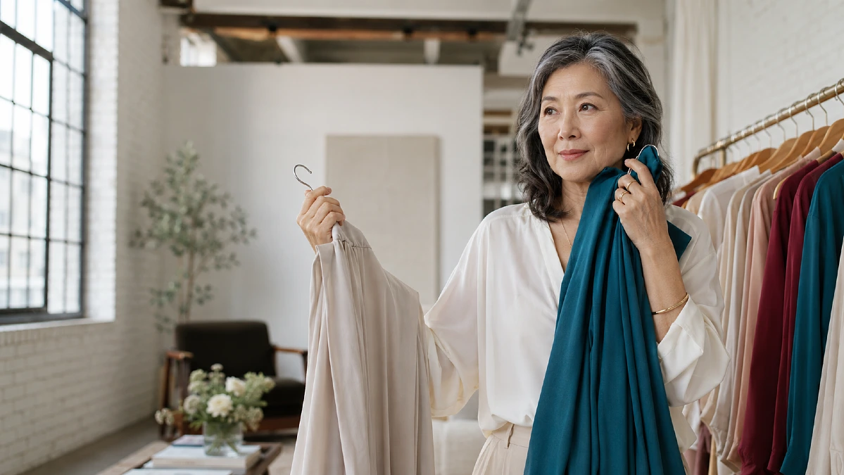
Some colors that once felt reliable can suddenly make your complexion look dull, tired, or uneven. That change can be confusing, especially when the clothes still fit and the color used to earn compliments.
As hair color, skin contrast, and natural pigmentation shift, certain shades can start competing with your face instead of supporting it. That does not mean women over 50 need a smaller or safer color palette.
The goal when dressing over 50 is simply to notice which colors bring clarity back to your face. With a few smart swaps in undertone, depth, and contrast, you can make outfits look fresher without replacing your wardrobe.
Why a Favorite Color Can Suddenly Look Different Near Your Face
A color does not become “wrong” because you reach a certain age. What changes is the relationship between the shade and your natural coloring.
Hair may become silver, softer, darker, or lighter. Brows can lose some contrast, while skin may appear less pink, golden, or deeply saturated than it once did.
That means a beige sweater, icy pastel, or harsh black top can sometimes pull attention away from your face instead of framing it.
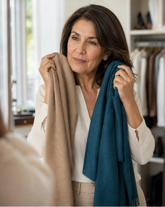
The easiest way to spot the problem is to look at your face before looking at the garment. If you notice shadows, redness, grayness, or unevenness first, the color may be doing more work against you than for you.
A better shade usually makes your eyes appear clearer and your complexion more even before you notice the clothes themselves.
Here is a simple way to read what a color is doing.
| What You Notice | What May Be Happening | Try Instead |
|---|---|---|
| Skin looks gray or flat | Shade is too muted or close to your skin tone | Add slightly more depth or saturation |
| Redness looks stronger | Color may be echoing unwanted red or orange tones | Try a cooler or calmer version |
| Under-eye shadows look deeper | Shade may be too dark or harsh near the face | Try a softer medium-depth color |
| Face seems to disappear | Outfit has too little contrast | Add a richer neckline color, scarf, or jacket |
| Clothes appear before your face | Shade may be too bright or intense | Choose a softened version of the same color |
You do not need perfect lighting or a professional color analysis to notice these differences. Daylight near a window is usually enough.
Beige, Camel, and Taupe Need the Right Undertone
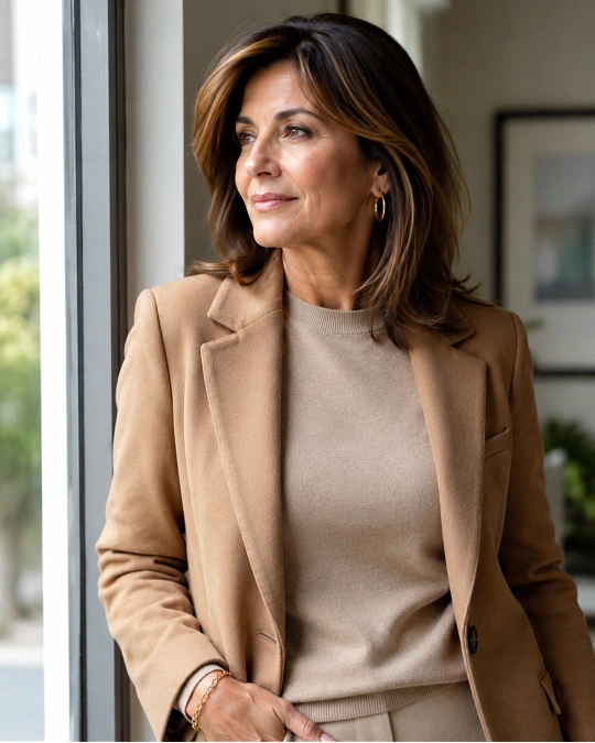
Neutral colors are often blamed for making mature complexions look dull, but beige itself is rarely the real problem. The undertone is usually what matters.
A yellow-heavy camel can make some complexions look sallow. A gray-heavy taupe may drain warmth from someone who looks better in richer neutrals.
Instead of giving up neutral clothing, move slightly warmer, cooler, lighter, or deeper.
Someone who looks washed out in pale oatmeal might look wonderful in mushroom, cocoa, soft navy, warm stone, olive, or charcoal.
Color note: Look at the neutral beside your bare face. If your skin seems clearer before you put it on and duller afterward, try another version of the same neutral family.
You can also keep an unflattering beige farther from your face. Beige trousers, skirts, handbags, and shoes may work beautifully even when a beige crewneck does not.
That distinction matters because dressing over 50 should be about using your wardrobe more intelligently, not throwing out whole color families.
Black Can Still Work, but It May Need a Softer Frame
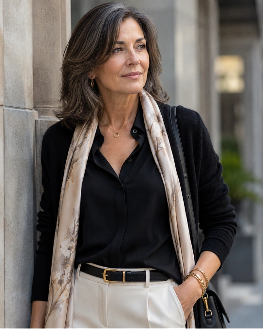
Black is useful. It is easy to match, practical for travel, and often creates a clean silhouette.
But solid black directly under the face can sometimes emphasize shadows, lines, or changes in skin contrast more than softer dark colors do.
That does not mean you should stop wearing it.
Try changing what sits closest to your face:
- Wear black trousers with a deep teal, berry, ivory, or blue shirt.
- Break up a black dress with earrings, a scarf, or an open jacket in a more flattering shade.
- Try charcoal, ink navy, espresso, or deep olive when true black feels severe.
- Choose an open neckline so there is more skin between your face and the dark fabric.
If black still makes you feel polished and confident, keep wearing it. The mirror matters more than a generic color rule.
This comparison can help if you love dark neutrals but want a softer result.
| If This Feels Harsh | Try This Instead | Why It Can Work |
|---|---|---|
| Jet black | Charcoal | Keeps depth with less contrast |
| Black-brown | Espresso | Adds warmth without looking light |
| Flat navy-black | Ink or midnight navy | Gives richness while staying versatile |
| Stark black and white | Black with cream | Softens the contrast near the face |
| Head-to-toe black | Black base with a colored top layer | Keeps the sleek base while adding facial color |
A simple black wardrobe can still form the backbone of stylish outfits for women over 50. You may only need to adjust the colors used in the top third of the outfit.
Very Pale Pastels Can Lose You Instead of Flattering You
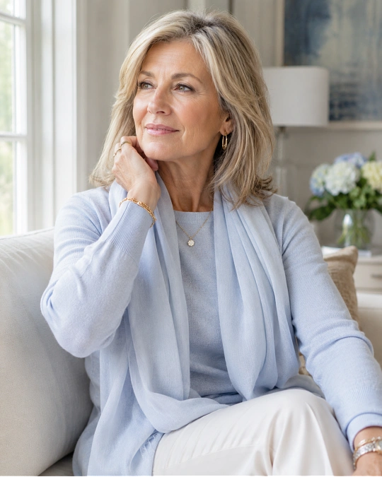
Powder pink, pale lavender, icy blue, and washed-out mint can be beautiful, but some pastels contain so little depth that they blend into the complexion.
This often becomes more noticeable when natural hair and facial contrast soften.
If a pastel makes your face fade, move one or two steps deeper rather than abandoning the color.
Try dusty rose instead of baby pink. Choose periwinkle instead of icy blue. Replace pale lilac with soft plum or muted violet.
The same principle works with green. A watery mint may feel weak, while sage, eucalyptus, jade, or muted teal gives the face more definition.
Try this: Hold two versions of the same color beneath your chin. One should be pale and the other slightly deeper. Look at your eyes and skin rather than the fabric.
The better shade often becomes obvious within seconds.
Bright Colors Work Best When Their Intensity Matches Yours
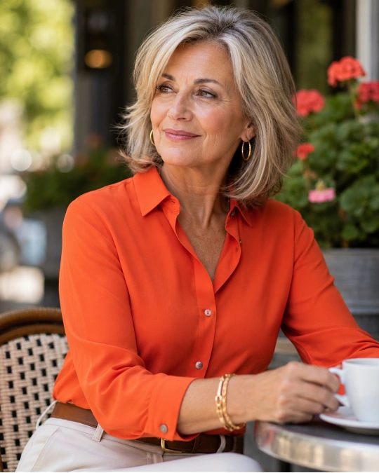
There is no reason women over 50 need to retreat into beige, navy, and gray. Strong color can look incredibly chic.
The issue is intensity.
A neon coral, electric lime, or very sharp cobalt can sometimes overpower softer natural coloring. Instead of seeing you first, the eye goes straight to the shirt.
If that happens, look for a more balanced version of the same hue.
Bright orange can become terracotta or paprika. Electric pink can become raspberry. Sharp green can become emerald, moss, or pine.
You are not making the outfit duller. You are adjusting the volume.
Here are a few easy swaps for real-life outfits.
| Occasion | Base Pieces | Color Swap | Why It Works |
|---|---|---|---|
| Errands | Jeans + knit top + sneakers | Raspberry instead of neon pink | Still lively, but easier near the face |
| Lunch | Trousers + blouse + flats | Teal instead of electric blue | Adds richness without shouting |
| Casual workday | Dark jeans + cardigan | Olive instead of acid green | Feels modern and grounded |
| Dinner | Black trousers + soft blouse | Burgundy instead of fire-engine red | Keeps drama with more depth |
| Travel day | Neutral trousers + jacket | Rust instead of fluorescent orange | Adds warmth and mixes easily |
The goal is not to mute every color. Some women look best in clear, vivid shades.
Use your reflection as the test. If your eyes appear brighter and your complexion looks more alive, the color is doing its job.
White Looks Better When You Choose the Right Version
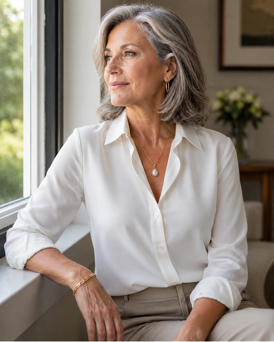
White can be surprisingly tricky because there is a major visual difference between optical white, soft white, cream, ivory, and ecru.
Bright blue-white creates strong contrast. On some complexions, that looks crisp and striking.
On others, it makes the skin appear warmer, redder, or more tired by comparison.
Cream and ivory create a gentler transition, especially when paired with camel, brown, muted green, soft denim, or gold-toned accessories.
But warmer white is not automatically better. If cream makes your complexion look yellow, a cleaner white may suit you more.
Fabric note: Texture can soften white too. Linen, brushed cotton, ribbed knits, and silk-like matte fabrics tend to reflect light differently from stiff, shiny white fabric.
That is why two white shirts can look completely different on the same person.
Build Your Outfits Around Two or Three Reliable Face Colors
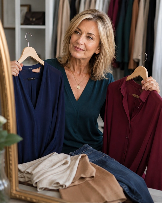
You do not need a complicated seasonal color system to make better choices.
Start by finding two or three colors you know make your complexion look clear. These become your dependable “face colors” for tops, scarves, jackets, dresses, and sweaters.
They might be navy, teal, ivory, raspberry, chocolate, olive, plum, soft blue, burgundy, or something entirely different.
Then let the rest of your wardrobe stay flexible.
A personal color formula might look like this:
Formula: flattering face color + dependable neutral + one repeated accessory color
For example, wear a teal knit with dark denim and tan loafers. Repeat the tan in your belt or handbag, and the whole outfit immediately feels connected.
Another day, use the same jeans and shoes with a berry blouse.
That is the beauty of a personal uniform. You are changing the color while keeping the outfit logic simple.
It also helps with cost-per-wear because new pieces need to work with colors you already trust instead of starting a completely new wardrobe story.
When a Color Is Wrong Near Your Face, Move It Somewhere Else
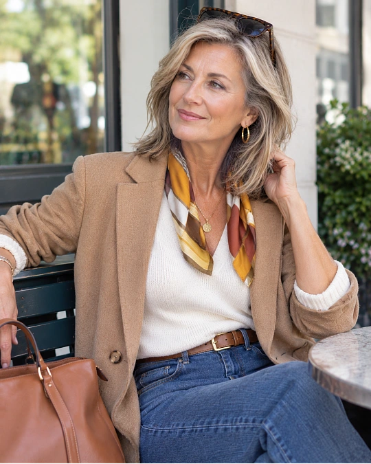
One of the most useful styling tricks is separating “I dislike this color on me” from “I cannot wear this color.”
Those are very different things.
If mustard makes your complexion look tired, you might still love a mustard handbag. If pale beige drains your face, beige trousers may still be one of your hardest-working wardrobe basics.
A few simple reframes can save clothes you already own:
- If a sweater feels dull, layer a flattering shirt collar underneath.
- If a dress color feels weak, add a jacket or scarf near the face.
- If a favorite print contains one difficult shade, repeat the more flattering color from the print in your accessories.
- If a dark top feels severe, open the neckline and add brighter earrings.
This keeps color advice from becoming restrictive.
Good style confidence over 50 comes from knowing how to adjust an outfit instead of feeling ruled by it.
Frequently Asked Questions
What colors make women over 50 look younger?
There is no universal “younger-looking” color. Shades that create healthy contrast and make your skin and eyes look clearer tend to feel fresher.
That may mean richer jewel tones for one woman and softer muted colors for another.
Should women over 50 stop wearing black?
No. Black can still look sleek, modern, and useful.
If it feels harsh near your face, try a softer neckline, colorful jewelry, an open jacket, or alternatives such as charcoal, navy, espresso, and deep olive.
How do I know if a color is washing me out?
Stand near natural daylight and hold the color beneath your face.
If shadows, redness, grayness, or uneven skin become more noticeable, compare it with a slightly warmer, cooler, lighter, or deeper version of the same shade.
Are jewel tones flattering after 50?
They can be very flattering because they provide color and depth without necessarily being neon-bright.
Emerald, sapphire blue, plum, teal, garnet, and rich berry shades are worth testing if very pale colors make you look faded.
Do gray hair and silver hair change which colors look best?
They can change your overall level of contrast, so some old favorites may behave differently.
Instead of following a fixed “gray hair palette,” test your existing colors again and notice which ones make your eyes, skin, and hair look most connected.