
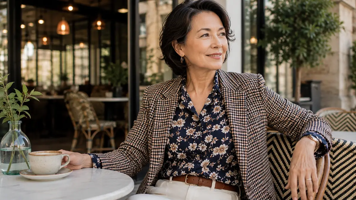
Pattern mixing can go wrong fast. One print feels interesting, but add another and suddenly the outfit looks busier, louder, or less polished than you intended.
That uncertainty can make women over 50 avoid prints altogether, especially when the goal is to look current without feeling overly styled. Yet wearing only solids can start to feel predictable when you actually enjoy color and personality.
The good news is that pattern mixing is less about fashion bravery and more about proportion, color, and visual balance.
Pattern Mixing Works Better When One Print Takes the Lead
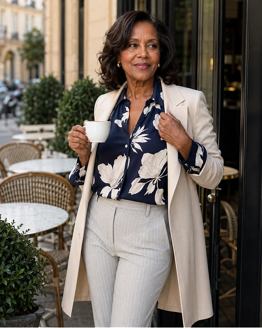
The easiest way to make two patterns look intentional is to stop asking them to compete.
One pattern should usually be more noticeable. The second can behave almost like a texture in the outfit.
For example, a navy floral blouse paired with very fine striped trousers feels calmer than pairing the same blouse with large, high-contrast stripes. Your eye knows where to look first.
Scale matters because two prints of equal visual strength can make the outfit feel crowded. Changing their size creates separation.
A larger botanical print can work beautifully with a tiny check. A medium leopard print can sit beside a narrow stripe. A broad plaid can work with a small dotted scarf.
This does not mean one print must always be tiny. The point is simply to create contrast between them.
Here is a quick way to judge pattern scale before you get dressed.
| Pattern Pairing | What to Look For | Why It Works |
|---|---|---|
| Large floral + fine stripe | Clearly different print sizes | The stripe acts almost like a neutral |
| Medium plaid + tiny dots | One structured print, one subtle print | The eye can separate the two patterns |
| Leopard + narrow stripe | Similar color strength, different shapes | The patterns feel related without matching |
| Bold geometric + micro check | Keep one pattern mostly below the waist | Creates a clear visual focal point |
| Wide stripe + delicate floral | Repeat at least one color | Color keeps the contrast from feeling random |
Fit note: Pattern already adds visual movement, so simple silhouettes often help. Straight trousers, clean shirts, uncomplicated skirts, and streamlined jackets give the prints room to do the interesting work.
Use One Shared Color to Make Two Prints Feel Connected
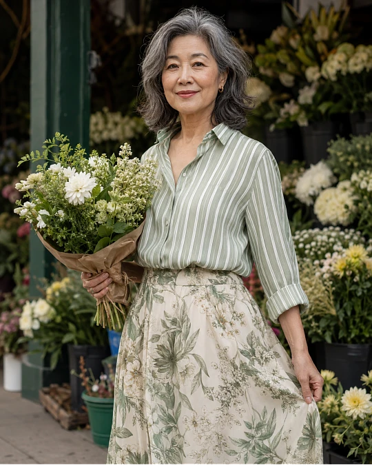
Color is often more important than the actual pattern.
Two prints can be completely different and still look cohesive when they repeat one obvious color.
A cream and navy striped knit, for example, can sit naturally with a navy, rust, and cream floral skirt because navy appears in both pieces. That repeated color gives your eye a visual bridge.
You can use this trick with neutrals too.
A black-and-white houndstooth jacket can work with a black-based floral blouse. Brown leopard can pair with a cream-and-brown stripe. A blue check can work with a scarf containing the same blue.
Try this when you are unsure: lay both prints next to each other and identify the color they share. If you cannot find one, the pairing may still work, but it will usually require more confidence and careful styling.
Color repetition makes pattern mixing much easier for everyday dressing because the outfit feels coordinated without looking overly matched.
You can also use a solid piece as the bridge between patterns.
For example:
- Printed blouse + solid trousers + patterned shoes
- Striped shirt + solid blazer + printed scarf
- Floral skirt + plain knit + checked coat
- Patterned trousers + solid top + patterned handbag
The solid piece gives your eye somewhere to rest.
Start With Stripes When You Want an Easy Second Pattern
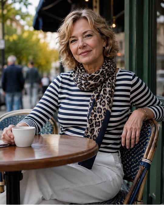
If pattern mixing still feels unfamiliar, stripes are one of the easiest places to begin.
A simple stripe has a regular rhythm, which makes it behave more like a wardrobe basic than a decorative print. That is why striped shirts regularly work with florals, checks, leopard, paisley, and even some geometric patterns.
A navy-and-white Breton-style top can sit under a muted plaid blazer without looking chaotic. A fine striped shirt can work with a floral scarf because the stripe feels structured while the floral feels softer.
The same idea works with footwear and accessories.
A striped knit with leopard loafers can be enough pattern mixing for an ordinary lunch or errand day. You are wearing two prints, but they are separated by solid trousers or denim.
For stylish outfits for women over 50, this kind of distance can make pattern mixing feel much more wearable.
Here are a few low-pressure combinations to test first.
| Occasion | Pattern Combination | Why It Feels Balanced |
|---|---|---|
| Errands | Striped tee + leopard flats + jeans | Denim separates the two prints |
| Lunch | Floral blouse + striped trousers | Different pattern scales create order |
| Work | Fine striped shirt + checked blazer | Both prints are structured and restrained |
| Weekend | Striped knit + patterned scarf | The smaller accessory keeps the mix subtle |
| Dinner | Printed skirt + striped knit | A shared color ties the pieces together |
Comfort upgrade: If a fully patterned outfit feels like too much, move one print to your shoes, scarf, belt, or bag. You still get personality without filling the entire silhouette with print.
Let Neutral Patterns Do the Work of Solid Colors

Some patterns are easier to mix because they function almost like neutrals.
Leopard is a good example when its colors are mostly tan, brown, black, or cream. Fine stripes, subtle houndstooth, small checks, and low-contrast plaids can work the same way.
Think about visual noise rather than labels.
A tiny charcoal check may actually feel quieter than a bright red solid blouse. A soft beige leopard print can feel calmer than a vivid jewel-tone trouser.
That gives you more freedom than the old idea that prints must always be paired with solids.
A leopard loafer can become your brown shoe. A fine striped tee can become your neutral knit. A small black-and-cream check jacket can work almost like a solid blazer.
The more muted the contrast inside the print, the easier it usually is to combine.
Color note: If you prefer calmer outfits, choose patterns where the background and print colors sit fairly close together. Cream with tan, navy with soft blue, or charcoal with gray will feel quieter than black against bright white.
This is especially useful when you want polished pattern mixing rather than a statement look.
Separate Strong Prints With Solid Pieces
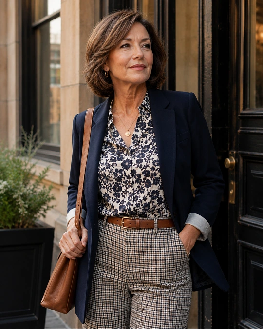
Pattern mixing does not have to mean placing one print directly against another.
In fact, spacing them apart is one of the easiest ways to make the look feel sophisticated.
A floral blouse with checked trousers may feel too busy for you. Add a solid navy blazer between them, and suddenly the outfit has structure.
The blazer creates a visual pause.
The same technique works with long cardigans, coats, denim jackets, belts, and plain skirts.
If an outfit seems almost right but slightly noisy, you may not need to remove a print. You may simply need more breathing room.
This table shows how a few common pattern-mixing problems can be softened without abandoning the idea completely.
| If This Feels Too Busy | Try This Instead |
|---|---|
| Floral blouse directly against plaid trousers | Add a solid blazer or cardigan |
| Bold striped top with large floral skirt | Choose a finer stripe or smaller floral |
| Two prints with no colors in common | Repeat one color through shoes, a belt, or a layer |
| Patterned jacket with patterned trousers | Swap one piece for a lower-contrast version |
| Print from neckline to shoes | Move the second print to an accessory |
There is no prize for wearing the maximum number of patterns.
Two well-chosen prints often create more impact than three or four competing ones.
Keep the Silhouette Simple When the Prints Are Doing More

Pattern mixing feels easier when the clothing shapes are straightforward.
A floral blouse, checked wide-leg trousers, ruffled jacket, statement necklace, and patterned shoe can all be attractive separately. Together, they create many focal points.
If two prints are already present, consider simplifying something else.
A clean crew-neck knit works well with patterned trousers. A straight midi skirt gives a mixed-print blouse and scarf a calm foundation. A simple blazer can make playful prints look sharper.
Proportion also matters.
If the top is loose and heavily printed, a cleaner trouser shape can bring the outfit back into balance. If a printed skirt is full, a closer-fitting knit can provide definition above it.
This is not about hiding your body or following rigid shape rules. It is about deciding where you want visual movement.
A good outfit usually gives the eye a clear path.
Shoe swap: When the clothing already contains two patterns, solid loafers, ankle boots, ballet flats, sleek sneakers, or simple sandals can keep the finish controlled.
If the clothes are mostly simple, patterned shoes can become the second print instead.
A Repeatable Pattern Formula for Real-Life Dressing
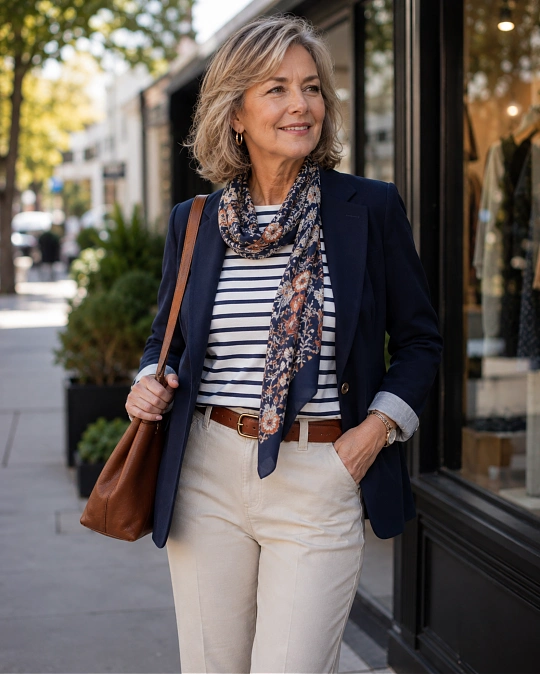
You do not need to invent a fresh combination every morning. A repeatable formula removes much of the guesswork.
Formula: main pattern + quiet pattern + solid anchor
Start with the pattern you genuinely want to wear. That might be a floral blouse, checked trousers, or a printed skirt.
Add a quieter second pattern that shares at least one color. Then place a solid somewhere in the outfit to give the prints breathing room.
For example, try a floral blouse + fine pinstripe trousers + solid navy blazer.
Another version could be a striped knit + leopard flats + straight-leg jeans.
For warmer weather, try a patterned midi skirt + striped tee + solid leather sandal.
For cooler months, a checked coat + subtle patterned scarf + plain sweater and trousers creates the same effect.
This formula helps pattern mixing become part of stylish outfits for women over 50 rather than something reserved for special occasions.
Once you find a version you like, repeat it. Changing the colors, shoes, or layers keeps the formula fresh without forcing you to rethink your wardrobe every time.