
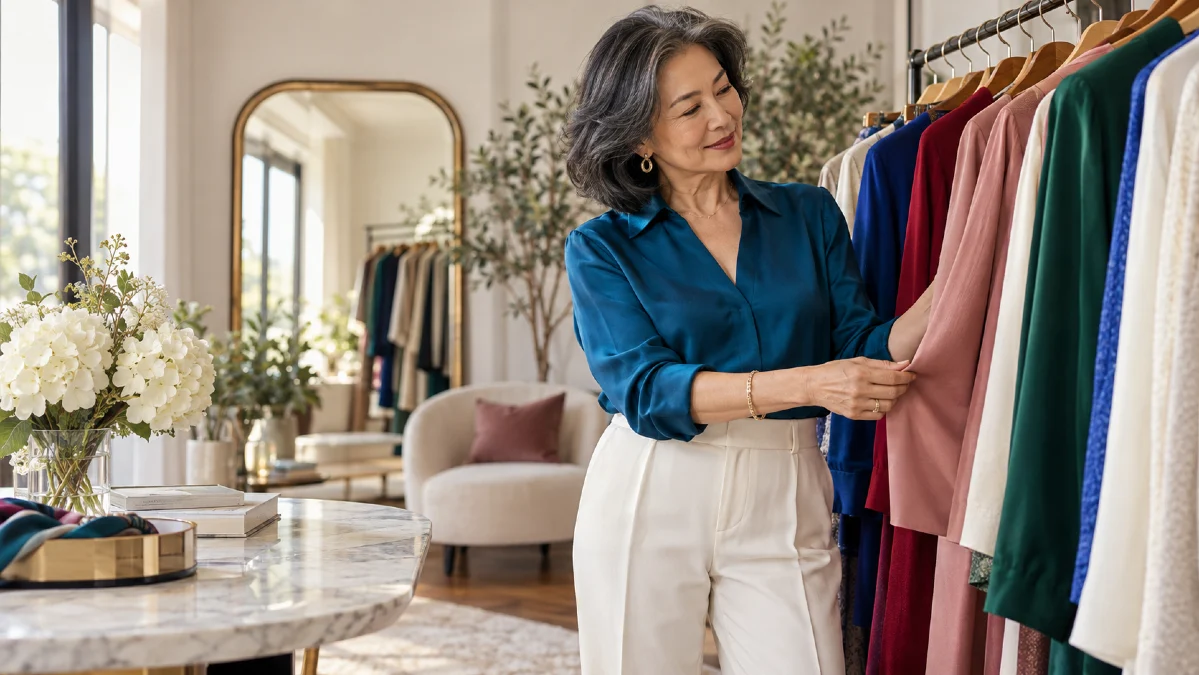
A color you once loved can suddenly seem dull against your face, even when the outfit itself fits beautifully. Finding the best colors for women over 50 can feel confusing, especially when fashion advice keeps telling you to wear brighter shades or avoid certain colors altogether.
The truth is that beautiful style has very little to do with following age-based color rules. Your hair color, skin undertone, natural contrast, and even the fabric you wear can change how a shade looks on you.
Some colors may bring warmth to your face, while others can make shadows more noticeable. The good news is that you don’t need a new wardrobe to see the difference.
Why Some Colors Start Looking Different After 50
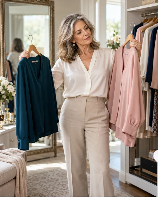
A sweater that looked wonderful ten years ago may not give you the same feeling today. That doesn’t mean the color has become unsuitable for your age. Your coloring, hairstyle, makeup, or personal taste may have changed.
For some women, natural hair becomes lighter or silver. This can change the contrast between their hair, skin, and clothing. Colors that once created a balanced look might now appear especially strong or unusually soft.
However, gray hair does not automatically mean you need pale colors. Some women with silver hair look wonderful in deep navy, rich burgundy, or bright cobalt blue. Others prefer gentle shades such as dusty rose or soft lavender.
The difference often comes down to how much contrast your natural features have.
𝐂𝐨𝐥𝐨𝐫 𝐧𝐨𝐭𝐞: The best test is not whether a color makes you look younger. It is whether your face looks fresh and balanced, and whether you enjoy seeing yourself in that shade.
Pay attention to what happens when a color sits close to your face. A top, scarf, or jacket can have a stronger effect on your overall appearance than trousers or shoes in the same color.
This is why you might love a certain shade in a handbag but feel less comfortable wearing it as a blouse. The color can still belong in your wardrobe, even if you prefer it away from your face.
Understand Your Skin Undertone Before Choosing Colors

Your skin undertone can help explain why two similar shades look completely different on you. Undertone refers to the warm, cool, or balanced tones beneath the surface of your skin.
Warm undertones often work well with colors that have golden, peach, or earthy qualities. Cool undertones may feel more balanced with blue-based reds, crisp blues, and certain pinks.
Neutral undertones can often wear shades from both groups. Still, undertone is only one part of the picture. The depth and brightness of a color also affect how it looks.
Warm, Cool, and Neutral Colors at a Glance
Use this table as a starting point for comparing colors you may already own.
| Color family | Warmer option | Cooler option |
|---|---|---|
| Red | Tomato red, brick | Cherry red, cranberry |
| Pink | Peach, warm coral | Rose pink, raspberry |
| Green | Olive, moss | Emerald, blue-green teal |
| Blue | Warm teal, petrol blue | Cobalt, sapphire |
| Neutral | Camel, cream | Charcoal, cool taupe |
| Purple | Warm plum | Lavender, blue-violet |
These are suggestions rather than strict rules. You may find that one cool shade looks beautiful on you while another feels too sharp.
A simple comparison is more useful than trying to fit yourself into one color category.
Try the Natural Light Color Test
Stand near a window during the day and hold two differently colored garments beneath your chin. Keep your makeup and lighting the same so you can make a fair comparison.
Notice whether one color makes your face appear more balanced while the other draws attention to shadows. You might also notice that one shade makes your eyes stand out more.
Try these comparisons:
- Ivory against bright white.
- Camel against cool taupe.
- Coral against raspberry.
- Olive green against emerald.
- Soft navy against charcoal gray.
If both colors look good, you don’t need to choose one forever. Your personal palette can include warm and cool shades, especially when you change the depth or intensity.
The Blues, Greens, Reds, and Pinks Worth Trying After 50
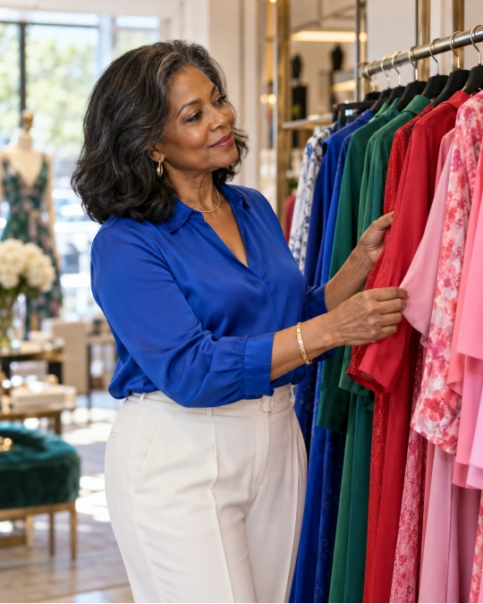
Some color families offer a wide range of flattering choices. The secret is finding the right version rather than assuming the entire color family works or doesn’t work.
Blue Can Be a Beautiful Alternative to Black
Navy is one of the easiest colors to build a wardrobe around. It works with white shirts, cream trousers, denim, soft pink, and many earthy shades without feeling too formal.
A medium or deep navy blouse can also provide contrast around the face without looking as stark as pure black. This makes it a useful option for everyday outfits for women over 50.
If you enjoy stronger colors, try cobalt blue or sapphire. These shades look especially striking beside crisp white, charcoal, or simple dark denim.
Women who prefer softer colors might feel more comfortable in slate blue, dusty blue, or muted denim blue. The important point is that blue offers far more than one flattering shade.
Green Brings Beautiful Depth to Simple Outfits
Green can be surprisingly easy to wear once you move beyond very bright shades. Olive, moss, forest green, emerald, and deep teal can all add interest to a wardrobe.
Olive and moss have an earthy quality that pairs well with camel, cream, chocolate brown, and denim. Emerald and blue-green teal offer a richer effect alongside navy or charcoal.
A green blouse under a neutral blazer can make a familiar outfit feel current. You don’t need bold accessories because the color itself provides enough interest.
𝐒𝐭𝐲𝐥𝐞 𝐭𝐢𝐩: If a green top feels too strong, try the same shade in a cardigan worn open over a cream or white shirt. The lighter layer creates space between the color and your face.
Rich Reds and Berry Shades Add Warmth and Interest
Red is often presented as a color that requires confidence, but it doesn’t have to be bright or dramatic. Burgundy, cranberry, brick red, and soft raspberry can look elegant in everyday clothing.
A burgundy cardigan with dark denim creates a relaxed look for lunch or errands. A raspberry blouse with navy trousers feels more polished without requiring complicated styling.
For a warmer effect, consider terracotta or muted brick. These colors work particularly well with cream, camel, and chocolate brown.
Bright red can be beautiful, too. If you love wearing it, there is no reason to give it up because of your age.
Soft Pink and Coral Can Feel Fresh Without Looking Childish
Pink is not reserved for younger women, and it doesn’t have to look overly sweet. Dusty rose, muted blush, warm peach, and deeper rose shades can add softness to simple clothing.
A dusty pink knit with gray trousers makes an elegant casual outfit. Coral can bring more energy to white linen trousers or medium-wash denim.
The fabric and cut help determine the finished effect. A clean-lined pink button-down shirt usually feels more refined than a heavily decorated top in the same shade.
If pale blush seems to blend into your complexion, try a deeper rose or raspberry. A little more color contrast may be all you need.
Choose Neutrals That Complement Your Natural Coloring
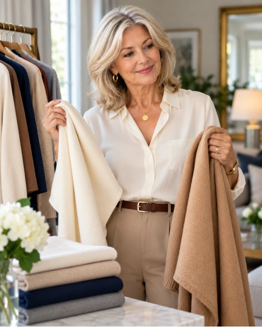
Neutral colors form the base of many stylish outfits for women over 50. Black, white, beige, gray, navy, and brown are all useful, but not every version of these colors creates the same effect.
The biggest mistake is assuming that neutral automatically means flattering. A soft beige sweater can be beautiful on one person and seem dull on another.
Black Doesn’t Have to Be Your Default
Black remains elegant, useful, and easy to style. However, its strong contrast can sometimes feel severe when worn directly beneath the face, especially if your natural coloring is soft.
If this bothers you, experiment with navy, charcoal, espresso brown, or deep olive. These colors provide similar versatility with a different degree of contrast.
You can also keep wearing black and adjust what sits closest to your face. An ivory shirt beneath a black blazer, for example, creates a lighter frame around your features.
A colorful scarf, silver necklace, or open neckline can also change how a black outfit feels. There is no need to remove black from a wardrobe that already works for you.
White and Cream Deserve a Side-by-Side Test
Bright white creates a clean, crisp appearance. It looks beautiful with navy, dark denim, cobalt, and many cool shades.
Cream and ivory offer a softer alternative. They can work well with camel, warm brown, olive, and muted pink.
Neither option is automatically better after 50. Compare a white shirt with a cream one in natural light, and notice which makes your face feel more balanced.
Fabric matters here as well. A smooth cotton shirt reflects light differently from a textured linen blouse, even when the shades are nearly identical.
Beige and Gray Work Best When They Have Enough Contrast
Beige can look polished, especially in well-made trousers, coats, and knitwear. But a beige that sits too close to your skin tone may make the outfit appear flat.
Try adding contrast with navy, chocolate brown, burgundy, or a deeper shade of beige. Mixing light and dark pieces can give the outfit more structure.
Gray offers similar flexibility. Cool charcoal, warm greige, soft dove gray, and medium heather gray create different effects.
If a pale gray top seems washed out, try charcoal near your face and keep the lighter gray for trousers or an outer layer.
Which Colors to Skip If They Make You Look Tired
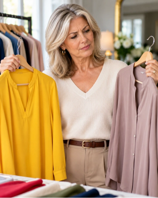
There is no universal list of colors women should stop wearing after 50. Still, certain shades can be difficult when they sit too close to your natural skin tone or create more contrast than you enjoy.
Very pale beige, dull yellow, flat gray, and harsh neon colors are worth testing carefully rather than automatically rejecting.
The goal is to recognize why a color isn’t working and make a small adjustment before giving it away.
Here are some common color concerns and more flexible ways to handle them.
| If this color feels unflattering | Try this adjustment instead |
|---|---|
| Pale beige blends into your face | Choose deeper camel or add a navy scarf |
| Light gray looks dull | Try charcoal or a blue-gray with more depth |
| Neon yellow feels overpowering | Use mustard, golden yellow, or a smaller accent |
| Stark black feels too severe | Add ivory near your face or try dark navy |
| Icy pastel looks too pale | Try a slightly deeper rose, blue, or lavender |
Be Careful with Colors That Match Your Skin Too Closely
A beige or pale peach top may create very little contrast with your face. If you notice that the outfit looks flat, try a darker jacket or a richer version of the same shade.
This doesn’t mean monochromatic dressing is unflattering. A combination of cream, oatmeal, and camel can look beautiful when the tones are distinct and the fabrics have texture.
Don’t Let Neon Colors Overpower the Outfit
Bright lime, electric yellow, and intense orange can be fun, but they can also become the first thing someone notices. If you prefer a quieter look, use these shades in smaller amounts.
A bright handbag, patterned scarf, or pair of shoes can add personality without taking over the entire outfit.
If you love a vivid color as a top or dress, wear it. The best approach is to balance it with simple cuts and fewer competing details.
Watch for Faded, Muddy Colors That Lack Definition
Some muted shades have a soft, expensive-looking quality. Others may look dull when the fabric has faded or the color sits too close to your natural coloring.
An old washed-out brown T-shirt, for example, may not give the same impression as a rich chocolate knit. Fabric condition can be just as important as the color itself.
Before deciding that a shade is wrong for you, compare it with a cleaner or deeper version. You may discover that the problem was the particular tone rather than the color family.
Build a Personal Color Palette Without Replacing Your Wardrobe
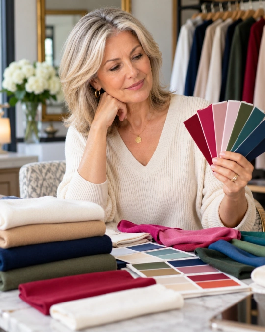
A useful color palette should make getting dressed easier, not create another set of rules. You need enough variety to enjoy your clothes, but not so many unrelated shades that nothing works together.
Start with what you already reach for. Your favorite clothes often reveal more about your personal taste than a seasonal color chart.
Look through your wardrobe and choose a few pieces that make you feel comfortable and confident. Pay attention to the colors, not just the fit.
Then use this simple method to narrow down your choices.
Start with Two Reliable Neutrals
Choose two neutral shades that work with most of your existing clothes. Navy and cream are one option, while chocolate brown and camel create a warmer combination.
Charcoal and ivory can also make a beautiful base. You don’t need to own every neutral color to build a useful wardrobe.
These pieces might include trousers, coats, cardigans, and jackets. Keeping the larger items in coordinated colors makes it easier to create more outfits from fewer clothes.
Add Two or Three Accent Colors
Choose colors that make you happy when you wear them near your face. A berry pink, emerald green, and soft blue could work together, especially with a navy base.
Another palette might use terracotta, olive, and muted rose alongside cream and camel. Both can create stylish outfits without feeling repetitive.
𝐁𝐮𝐝𝐠𝐞𝐭 𝐭𝐢𝐩: Try accent colors through scarves, inexpensive tops, or accessories before investing in coats and expensive knitwear. This gives you time to learn what you actually enjoy wearing.
Consider Your Hair Color Without Letting It Control Your Choices
Silver, gray, blonde, brunette, and red hair can all look beautiful with many different colors. Hair color may affect contrast, but it does not determine your entire wardrobe.
For example, silver hair can look striking beside cobalt or burgundy. Warm blonde hair may pair beautifully with teal or camel, while dark hair can create strong contrast with ivory.
These are ideas to test, not fixed pairings. Your skin tone, eye color, and personal preference still matter.
If you’ve recently changed your hair color, revisit a few tops that you haven’t worn in a while. You may be surprised by which ones now feel right.
Easy Color Combinations That Make Outfits Look Polished
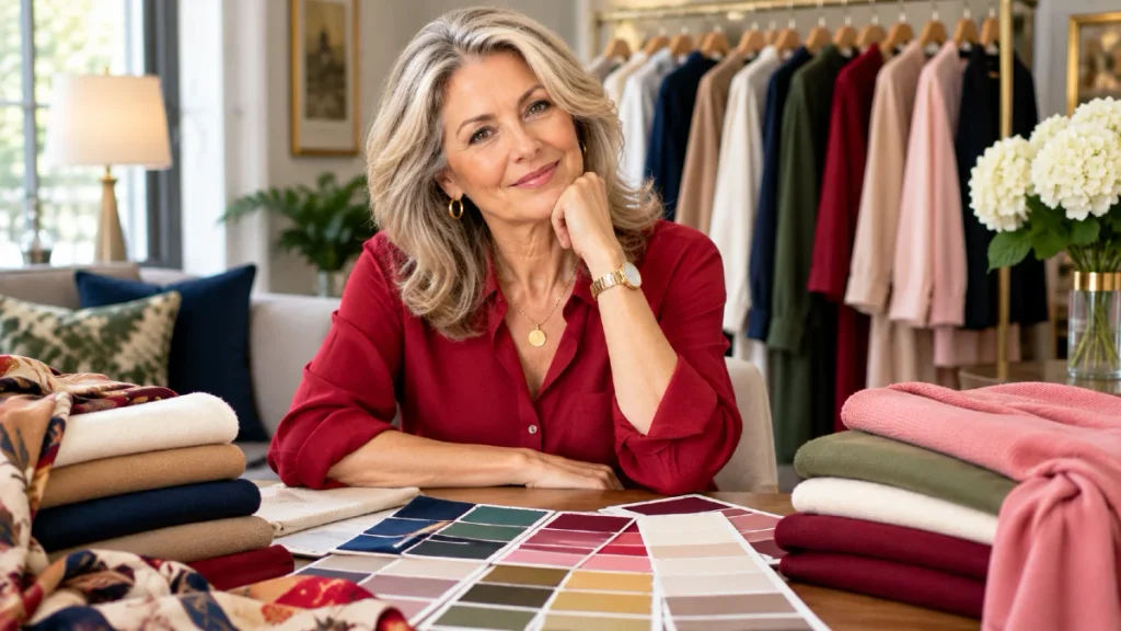
The easiest way to wear color is to stop treating every item as a separate choice. A simple three-color approach can make your outfits look coordinated while still leaving room for personality.
Start with a neutral base, add one color that looks good near your face, and finish with a supporting neutral or accent.
Here are a few combinations that work for different occasions.
| Occasion | Three-color combination | What to wear |
|---|---|---|
| Casual errands | Navy + ivory + burgundy | Navy jeans, ivory knit, burgundy cardigan |
| Lunch with friends | Cream + olive + tan | Cream trousers, olive blouse, tan loafers |
| Smart casual work | Charcoal + dusty rose + black | Charcoal trousers, rose shirt, black blazer |
| Weekend outing | Denim blue + coral + white | Straight jeans, coral top, white trainers |
| Evening dinner | Espresso + champagne + berry | Espresso trousers, champagne blouse, berry scarf |
These combinations work because the pieces share a clear color direction. The neutral shades create balance while the accent shade adds interest.
You can adjust any formula to suit your skin tone or favorite colors. Swap burgundy for raspberry, olive for teal, or ivory for crisp white.
The aim is to create a personal uniform you can repeat without looking as though you’re wearing the same outfit every day.
A simple approach also helps when packing for travel. Choosing coordinated colors means fewer pieces can create more combinations.
Frequently Asked Questions
What colors make women over 50 look younger?
There is no single color that makes everyone look younger. However, shades that complement your undertone and natural contrast may help your face appear fresher and more balanced.
Try navy, teal, berry, soft rose, or cobalt as starting points. Choose the versions that suit your coloring rather than focusing on looking a certain age.
Should women over 50 stop wearing black?
No. Black remains a classic wardrobe color and can look beautiful at any age.
If you find it too harsh near your face, add a cream blouse, colorful scarf, or softer neckline. Navy, charcoal, and espresso brown are useful alternatives if you want a change.
What colors look best with gray hair?
Gray and silver hair can look beautiful with navy, cobalt blue, emerald green, burgundy, raspberry, and certain soft pinks. The best choices depend on your skin tone and the contrast between your hair and features.
Try both rich and muted shades rather than assuming gray hair requires pastels.
Is beige a bad color for older women?
Beige is not a bad color, but some shades may blend too closely with your complexion. This can make an outfit appear less defined.
Try camel, oatmeal, stone, or deeper taupe instead. Adding a darker jacket or colorful scarf can also help.
How many colors should a woman have in her wardrobe?
There is no required number, but two or three main neutrals and two or three accent colors are a useful starting point. This makes coordinating clothing easier without limiting your personal style.
You can always add seasonal colors or statement pieces as your taste changes.