
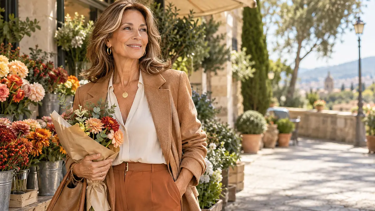
Beautiful outfit can still feel wrong when the color near your face leaves you looking tired or washed out. That frustration becomes even more noticeable when old favorite shades suddenly seem less flattering than they once did.
For many women over 50, changes in hair color, makeup, and overall contrast can affect how clothing colors appear. Your undertone may be warm, yet the shades that once worked may need a small adjustment.
Choosing better color is not about following a strict seasonal palette. The right shades can make stylish outfits for women over 50 easier to build because your clothes begin working with your natural coloring instead of competing with it.
Start With the Colors Closest to Your Face
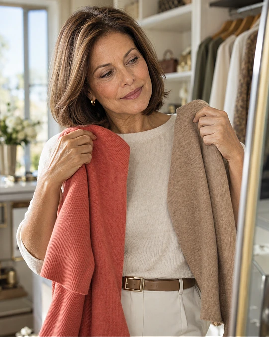
Warm undertones usually respond well to colors with a yellow, golden, peach, olive, or earthy quality. That does not mean every warm color will suit you equally.
The easiest test is comparison. Hold two similar colors near your face in natural daylight, such as bright white and ivory, or cool raspberry and warm coral.
Notice which shade makes your skin appear more even and your eyes more noticeable. The better color often feels softer and more connected to you.
Do not depend only on vein color or the old rule that gold jewelry automatically means a warm undertone. Those clues can help, but clothing comparisons are often more useful.
Hair also affects the final result. Gray, silver, highlighted, red, brunette, and blonde hair can all change the amount of contrast around your face.
That means your best palette may become softer, deeper, or slightly brighter even when your underlying warmth remains similar.
Try this: Pull five tops from your closet and photograph yourself wearing each one beside a window. Looking at the photos together often makes the strongest colors much easier to spot.
Warm Neutrals Make the Easiest Wardrobe Base
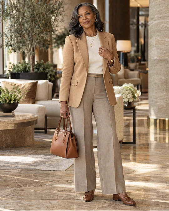
The most useful warm colors are often not the dramatic ones. Cream, camel, chocolate, warm taupe, tan, and soft olive can create the base of a very practical wardrobe.
These colors work because they mix easily without creating harsh contrast. They also make denim, prints, jewelry, and brighter accent colors easier to combine.
If black feels severe close to your face, you do not need to remove it from your wardrobe. Keep black trousers, skirts, boots, or handbags and try a warmer color on top.
Here is a useful starting point for building a warm neutral palette.
| Piece or Color | What to Look For | Mixes Well With |
|---|---|---|
| Ivory | Creamy white rather than blue-white | Camel, denim, olive, rust |
| Camel | Medium golden brown without too much orange | Ivory, chocolate, teal |
| Warm taupe | Beige-brown with warmth rather than gray | Olive, cream, coral |
| Chocolate | Rich brown with enough depth to replace black | Peach, teal, rust |
| Soft olive | Muted green with yellow or brown warmth | Ivory, tan, warm navy |
These shades are especially useful for a capsule wardrobe over 50 because they repeat well. A camel jacket, ivory knit, chocolate trouser, and olive overshirt can create many outfits without looking repetitive.
Fabric note: Matte wool, brushed cotton, suede, linen blends, and soft knits make earthy colors feel rich. Very shiny fabrics can sometimes make camel, bronze, or mustard appear louder than expected.
Rich Earth Tones Bring Warmth Without Feeling Too Bright
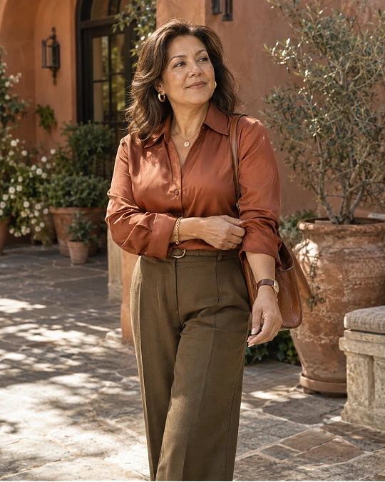
Rust, terracotta, cinnamon, paprika, ochre, and burnt orange are natural partners for warm undertones. Their brown or golden base keeps them softer than sharp primary colors.
You also do not have to wear these shades from head to toe. One earthy piece can give a simple outfit enough color.
A rust cardigan over an ivory top works with dark denim. Terracotta trousers look polished with cream knitwear and tan loafers.
Ochre can be especially useful in scarves, jackets, prints, or handbags when a full mustard sweater feels too strong.
A few combinations worth trying include:
- Terracotta with ivory and cognac
- Rust with dark denim and camel
- Olive with cream and chocolate
- Paprika with warm navy and tan
- Cinnamon with soft beige and gold jewelry
The reason these combinations work is balance. One richer color gives the outfit personality while the surrounding neutrals keep the look calm.
This is often the easiest route to chic outfits for women over 50 when you want more color but still prefer a polished wardrobe.
Choose Reds, Pinks, Greens, and Blues With a Warmer Base
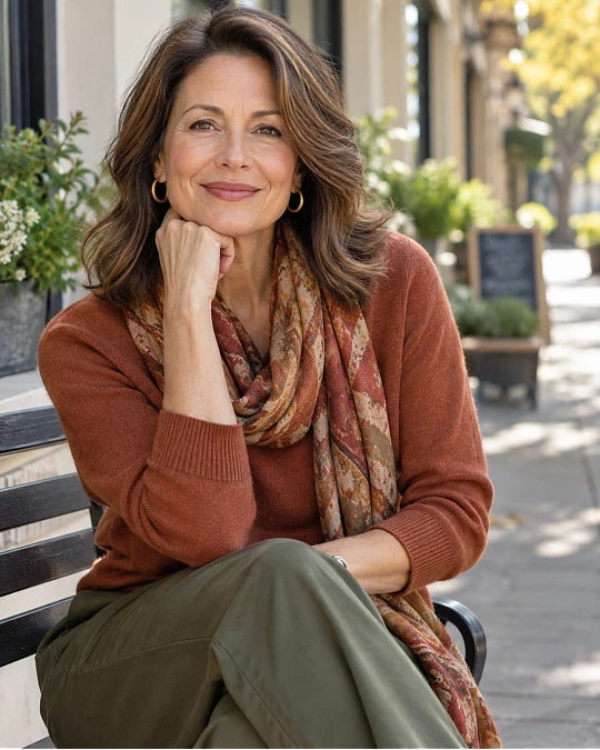
Having warm undertones does not mean living in beige and brown. You can wear plenty of stronger colors.
The trick is choosing the version of the color that has warmth or softness built into it.
Instead of a blue-based cherry red, try tomato, brick, or poppy red. Instead of icy pink, look at peach, salmon, coral, or warm rose.
Green is especially flexible. Olive, moss, khaki, warm forest green, and avocado tones often sit beautifully beside warm skin.
Blue may take a little more experimenting, but teal, turquoise, petrol blue, peacock, and softer warm navies can be excellent choices.
Color note: The word on the clothing tag matters less than the shade itself. Two sweaters both called “navy” may have completely different undertones.
Put the fabric beside cream, camel, or olive. If the blue looks harmonious rather than sharp beside those shades, it will probably be easier to use in a warm wardrobe.
If a Color Feels Too Cool, Change the Shade Instead of Giving It Up
Color advice becomes frustrating when it sounds like a long list of things you are no longer allowed to wear. That is not necessary.
Most color families contain warmer and cooler versions. A small change in shade can often solve the problem.
This comparison makes the idea easier to use when shopping or checking your closet.
| If This Feels Harsh | Try This Instead |
|---|---|
| Stark optic white | Ivory, cream, soft ecru |
| Icy baby pink | Peach, salmon, warm rose |
| Blue-red berry | Tomato red, brick, coral red |
| Cool charcoal | Chocolate, warm taupe, brown-gray |
| Icy pastel blue | Teal, petrol, muted turquoise |
| Cool purple | Aubergine, plum with a reddish base |
You can still wear a cool color you love. Just move it farther from your face.
A cool gray trouser may work beautifully with an ivory blouse. A lavender skirt can feel more connected when worn with camel shoes and a warm cream knit.
This is one of the easiest ways to make dressing over 50 feel less restrictive. Color becomes something you adjust, not a rule you obey.
Use Jewelry, Prints, and Accessories to Connect the Palette
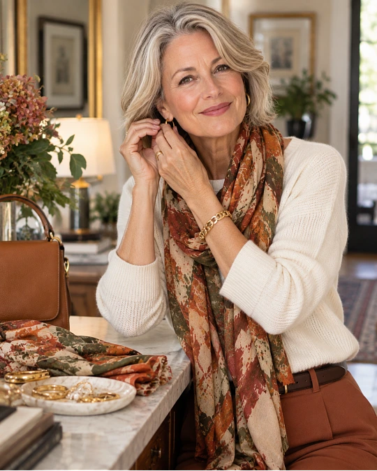
Accessories can help when an outfit feels almost right but slightly disconnected.
Gold, bronze, brass, copper, tortoiseshell, cognac leather, and warm tan often blend easily with a warm palette. Mixed metals can work too, especially if you already wear both gold and silver.
Prints are another useful bridge. A scarf containing navy, rust, ivory, and olive can connect several pieces that might otherwise feel unrelated.
When choosing a print, look at the color sitting closest to your face. If the background is flattering, the smaller cool colors inside the print usually matter much less.
Budget-friendly swap: Before buying new clothing, try changing the scarf, earrings, necklace, or jacket around an outfit you already own. The right warm accent may be enough.
This approach also makes stylish outfits for women over 50 easier to repeat. You can keep the same simple base while changing smaller details.
Build a Warm-Color Outfit Formula You Can Repeat
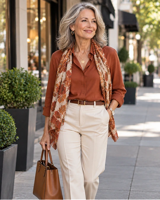
A useful color palette should make mornings easier. You should not need a complicated color wheel every time you get dressed.
Start with one warm neutral, add one supporting color, and finish with one richer accent if you want more interest.
Here are several formulas you can adapt to pieces already in your wardrobe.
| Occasion | Pieces | Why It Works |
|---|---|---|
| Everyday errands | Dark denim + ivory knit + camel jacket | Warm color stays close to the face while denim keeps it casual |
| Lunch with friends | Chocolate trousers + coral blouse + tan loafer | Coral adds life while brown keeps the outfit grounded |
| Smart casual | Warm navy trouser + cream top + olive jacket | Three soft colors create contrast without looking harsh |
| Travel day | Olive trousers + oatmeal knit + cognac shoe | Earthy neutrals mix easily and hide minor travel wear |
| Casual dinner | Dark denim + rust blouse + gold jewelry | Rust becomes the focus while the rest stays simple |
Your personal formula might be even simpler.
Formula: warm neutral bottom + flattering near-face color + one connected accessory.
For example, wear chocolate trousers with an ivory blouse and a cognac loafer. Change the blouse to coral or teal another day and the basic outfit still works.
That repeatability is what turns color advice into a real wardrobe system rather than another set of fashion rules.