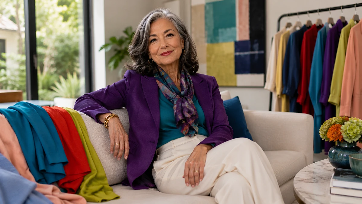
Color can suddenly feel harder when the shades in stores get brighter, stranger, or far removed from the neutrals you already trust. For many women over 50, the real question is not “Can I wear this?” but “Will it work with my life, my coloring, and the clothes I already own?”
That is where 2026 gets interesting. Runways are moving toward stronger blues, purples, reds, greens, and warm yellows, yet there is still plenty of room for cream, navy, gray, and softer tones.
The best stylish outfits for women over 50 do not chase every trend. They use color with intention, choosing shades that brighten the face, mix easily, and make familiar wardrobe basics feel current without forcing a full closet reset.
The 2026 Color Mood Is Brighter, but You Do Not Need a Brighter Wardrobe
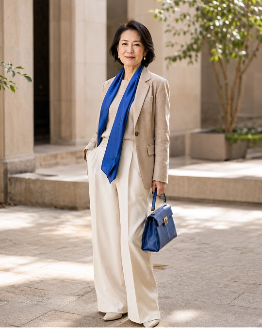
One of the clearest changes in 2026 fashion is the return of noticeable color. Spring collections featured lime, violet, scarlet, turquoise, yellow, fuchsia, and creamy whites, while fall continued the story with electric blue, royal purple, red, turquoise, peach, and burgundy.
That sounds bold on paper. In real life, however, a trend color does not need to cover your entire body to make an outfit look current.
A cobalt sweater with navy trousers can do the job. So can a plum scarf over a gray coat, a turquoise blouse under a cream jacket, or red flats worn with jeans and a white shirt.
The useful question is not which color is supposedly “best” after 50. It is which version of the trend works with your coloring, wardrobe, comfort level, and normal routine.
If vivid chartreuse makes you feel uncomfortable, you do not need it beside your face. Try a mossier green trouser, handbag, print, or shoe instead.
If bright red feels wonderful on you, there is no reason to reduce it to a tiny accessory. A red knit or dress can become part of your personal uniform.
Here is a practical starting point for translating runway colors into a wearable wardrobe.
| 2026 Color Family | Easy Wardrobe Version | Pair It With |
|---|---|---|
| Electric and icy blues | Shirt, cardigan, scarf | Navy, charcoal, white, denim |
| Royal purple and plum | Knit, blouse, handbag | Cream, gray, chocolate, black |
| Red and peach | Sweater, jacket, flats | Denim, camel, white, navy |
| Chartreuse and moss | Scarf, shirt, trouser | Chocolate, cream, charcoal |
| Cream and soft white | Jacket, knit, trouser | Burgundy, navy, teal, tan |
Start with the row closest to colors you already wear. Adding one neighboring shade usually feels far more natural than building an outfit around a color you have never liked.
Icy Blue, Cobalt, and Turquoise Make Familiar Basics Feel New
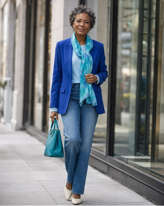
Blue is one of the most useful places to begin because 2026 offers several versions rather than one strict shade. Icy blue appeared strongly in spring coverage, while electric blue and turquoise continued into fall.
That range matters. You can choose a soft blue if stronger colors feel distracting, or move toward cobalt and turquoise if you enjoy more contrast.
For an everyday outfit, try a pale blue button-front shirt with dark straight-leg jeans and loafers. The lighter color near the face softens the outfit, while dark denim gives it enough structure to feel pulled together.
Cobalt works beautifully when the rest of the outfit stays quiet. A cobalt crewneck with charcoal trousers, for example, creates a clear focal point without requiring extra styling.
Turquoise can be surprisingly sophisticated with deeper neutrals. Vogue’s fall 2026 reporting showed the shade moving beyond summer, including combinations with olive and red on the runway.
For everyday wear, you can simplify that idea by pairing turquoise with navy, chocolate, cream, or dark denim.
Fabric note: Bright blue often looks richer in matte fabrics such as cotton, wool, linen blends, and soft knits. High-shine fabric makes saturated color more dramatic, which can be lovely for evening but less useful for a casual wardrobe.
Try this: Pull every blue item you own onto the bed. You may already have the beginnings of a 2026 color story without buying anything.
Royal Purple and Plum Offer a Rich Alternative to Black
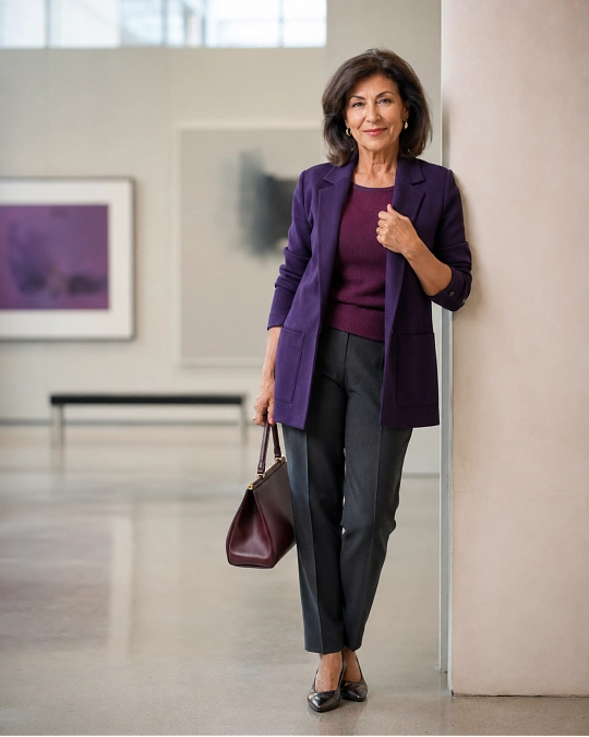
Purple has moved well beyond a brief spring trend. Royal purple appeared repeatedly across the fall/winter 2026 collections, while deeper plum emerged as another strong autumn direction.
For women who wear plenty of black, navy, brown, and gray, this is one of the easiest trend families to adopt. Purple has enough depth to sit comfortably beside those neutrals without disappearing into them.
A plum cardigan over a cream shell and charcoal trousers feels calm but more interesting than another black layer. Royal purple with dark denim creates more contrast and can make a very basic outfit feel intentional.
If saturated purple feels strong near your face, move it lower. Try trousers, a midi skirt, loafers, a belt, or a structured handbag.
Plum is especially useful in a capsule wardrobe because it can behave almost like a neutral. It works with cream, chocolate, gray, navy, black, and many shades of denim.
Color note: Do not worry about finding the exact runway shade. Aubergine, blackberry, wine-purple, plum, and amethyst can all bring the same updated feeling while allowing you to choose the depth that suits you.
That kind of flexibility is what makes trends useful rather than restrictive.
Red, Butter Yellow, and Peach Bring Warmth Without Taking Over
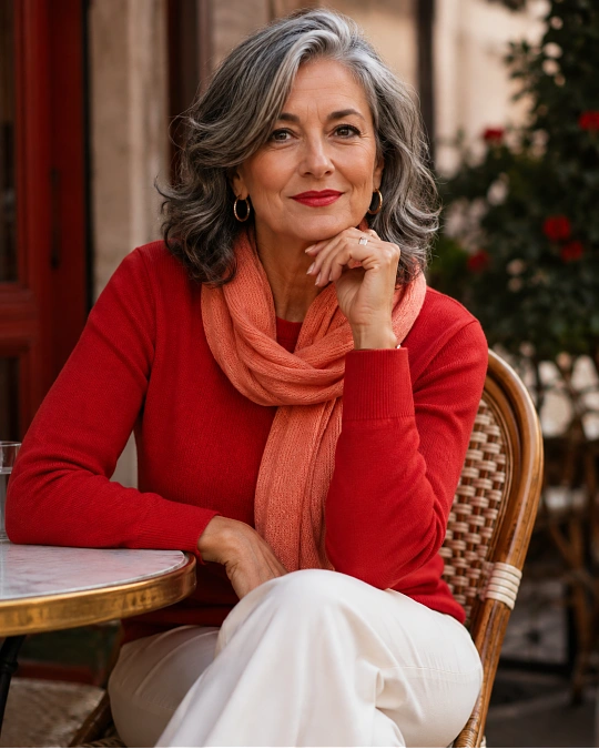
Some of the most noticeable 2026 shades sit on the warmer side of the color wheel. Strong red has remained visible across the year, while butter yellow and peach give women softer ways to bring warmth into an outfit.
Red is particularly effective because even a small amount has presence. A red cardigan over a white T-shirt and jeans can make familiar wardrobe basics look sharper with almost no extra effort.
Butter yellow behaves differently. In its palest forms, it can almost work like cream, which is why Vogue described it as one of the easier yellow shades to combine with neutrals.
Peach sits between pink and orange, so the effect changes depending on the piece. A muted peach blouse can look soft beside camel or ivory, while a stronger melon scarf can bring life to navy or chocolate.
The key is choosing the amount of warmth you enjoy rather than assuming the runway version has to be copied exactly.
A few small adjustments can keep these brighter shades looking polished rather than overly busy.
| Instead of This | Try This |
|---|---|
| Buying several bright pieces at once | Add one colored knit or accessory to clothes you already wear |
| Matching shoes, bag, scarf, and top exactly | Repeat the color once, then use quiet neutrals |
| Wearing a difficult shade beside your face | Move it to trousers, shoes, a belt, or a bag |
| Mixing several trend colors on the first try | Pair one strong color with navy, denim, cream, gray, or brown |
| Choosing color only because it is fashionable | Choose the version that makes you want to wear it repeatedly |
There is also no requirement to make warm shades look delicate. A tomato-red blazer with a white tee and dark jeans can look crisp and modern rather than romantic.
That freedom is part of good dressing over 50. Trends should give you more choices, not more rules.
Chartreuse, Moss, and Olive Give Green a Fresh 2026 Direction
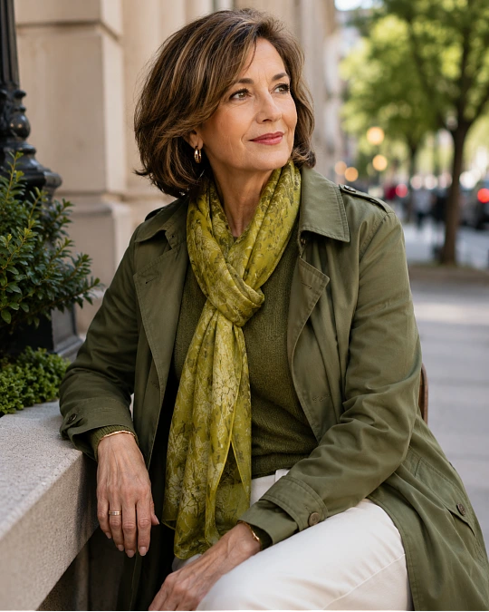
Green is one of the more interesting stories of the year because its versions sit at opposite ends of the comfort scale. Spring brought vivid lime and chartreuse, while autumn collections moved toward quieter moss and olive alongside other stronger shades.
If you enjoy strong color, chartreuse can make a surprisingly good accent. A chartreuse scarf with charcoal outerwear or a bright green knit with dark trousers needs very little else.
If that feels too sharp, there is no need to force it. Moss and olive give a related but calmer effect and often mix easily with pieces already found in a mature capsule wardrobe.
Olive trousers with a cream knit create a relaxed base for errands or travel days. Add loafers, sneakers, or ankle boots depending on how polished you want the outfit to feel.
A moss jacket can also replace the predictable black or tan layer. Because the shade has earthy depth, it can work with denim, chocolate, cream, burgundy, soft pink, and several blues.
Comfort upgrade: If you normally live in neutral clothes, introduce green through a relaxed cardigan, soft scarf, or casual jacket rather than a highly fitted statement piece. You will notice the color before you notice the garment.
This is a good example of how trendy outfits for women over 50 can still feel practical. The newness comes from color, while the shapes remain familiar.
Cream, Midnight Navy, and Carbon Gray Keep Bright Colors Grounded
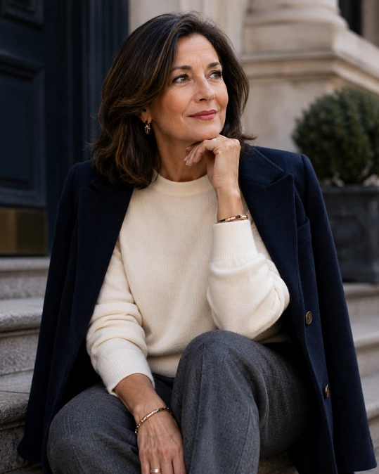
Not every important 2026 color is loud. Pantone’s autumn/winter report described a season that balances expressive shades with more restrained and earthy colors, while runway reporting has highlighted midnight tones, carbon gray, and creamy whites.
Spring also gave soft white a major role through Pantone’s 2026 Color of the Year, Cloud Dancer, a gentle off-white that appeared alongside much brighter runway colors.
These quieter shades matter because they make the stronger colors easier to wear.
Midnight navy can replace black under cobalt, red, turquoise, or plum. Carbon gray gives yellow and purple a more grounded base without creating the harder contrast of black.
Cream is especially useful around the face. A cream blouse, knit, blazer, or scarf can soften burgundy, moss, teal, royal purple, and bright blue.
Texture makes these neutrals more interesting. Think ribbed cream knitwear, brushed gray wool, navy denim, matte satin, linen blends, suede, or softly structured cotton.
A quiet color does not need to mean a forgettable outfit. Good fabric, clean proportions, and one stronger shade usually create more impact than covering yourself in several competing trends.
Build Your 2026 Color Formula Around One Shade You Already Love
The easiest way to use trend colors is to turn them into a personal formula. Begin with a neutral base you trust, add one current shade, then finish with a shoe or layer that relates to the base rather than competing with the color.
Formula: trusted neutral + 2026 color + simple finishing piece.
For example, dark jeans + turquoise shirt + tan loafers works because the jeans and shoes create a familiar frame. The shirt provides the freshness.
The same logic works across casual, smart casual, work, and evening outfits.
| Occasion | Easy Color Formula | Why It Works |
|---|---|---|
| Errands | Dark jeans + butter-yellow knit + white sneakers | Soft color freshens a familiar casual base |
| Lunch | Cream trousers + plum blouse + tan loafers | Plum adds depth while cream keeps the outfit light |
| Work or meeting | Charcoal trousers + cobalt shirt + navy blazer | Related dark neutrals calm the stronger blue |
| Travel day | Olive trousers + cream knit + turquoise scarf | Comfortable basics gain color without extra layers |
| Dinner | Black trousers + red blouse + simple metallic jewelry | One strong color provides enough evening impact |
Once you find a combination that feels right, repeat it. Change the blouse, switch the shoe, roll the sleeve, add a scarf, or replace trousers with jeans.
A reliable formula is more useful than constantly searching for new outfits. It reduces decision fatigue while still leaving room for style confidence over 50.
Before buying another trend piece, ask one simple question: Can I wear this color with at least three things I already own?
If the answer is yes, it has a much better chance of earning regular wear and giving you a good cost-per-wear.
Frequently Asked Questions
What colors are trending in fashion for 2026?
Major 2026 fashion directions include electric and icy blues, turquoise, royal purple, plum, vibrant red, butter yellow, peach, chartreuse, olive, cream, midnight navy, and deep gray. The exact mix changes by season, with spring leaning brighter and autumn adding richer, darker versions.
You do not need every shade. Choose the few that work naturally beside your existing neutrals.
What are the easiest 2026 colors to wear with a neutral wardrobe?
Blue, plum, burgundy, olive, and butter yellow are good starting points because they combine easily with common wardrobe neutrals. Navy, gray, cream, denim, camel, chocolate, and black can keep each shade grounded.
If you usually wear very little color, start with a knit, blouse, scarf, bag, or shoe rather than changing your entire outfit.
Can women over 50 wear bright colors?
Yes. Age does not determine how much color you are allowed to wear.
The more useful questions are how the shade works with your coloring, how comfortable you feel in it, and how well it fits your existing wardrobe. Bright cobalt, red, purple, turquoise, or chartreuse can all look polished when the rest of the outfit has clear proportions and a controlled palette.
How can I tell if a trendy color suits me?
Hold the color near your face in natural daylight and look at your overall appearance rather than focusing on rules about undertones. If you feel brighter and more defined, it may be a good near-the-face color.
If you love the shade but dislike it beside your face, wear it farther away through trousers, skirts, shoes, bags, belts, or accessories.
How many trend colors should I add to a capsule wardrobe?
There is no fixed number. One or two colors that mix with several of your existing pieces will usually be more useful than six shades that require separate outfits.
Think in terms of repeat wear. A plum cardigan worn with cream, denim, gray, and brown earns its place much faster than a dramatic piece you can style only once.