Color can feel risky when your closet has slowly become a safe place full of navy, black, beige, and “easy” pieces.
That does not mean your style is boring. It usually means you are tired of guessing. Some bright colors feel too loud, some pastels feel too sweet, and some trends seem made for women who do not live real lives.
The good news is that 2026 color trends are kinder than they look. They are not asking women over 50 to dress like someone else.
What Makes a 2026 Color Worth Adding
A color only earns space in your wardrobe if it works with your life.
That means it should mix with what you already wear, flatter the fabric it comes in, and give you more outfit options instead of one “special” piece that sits in the closet.
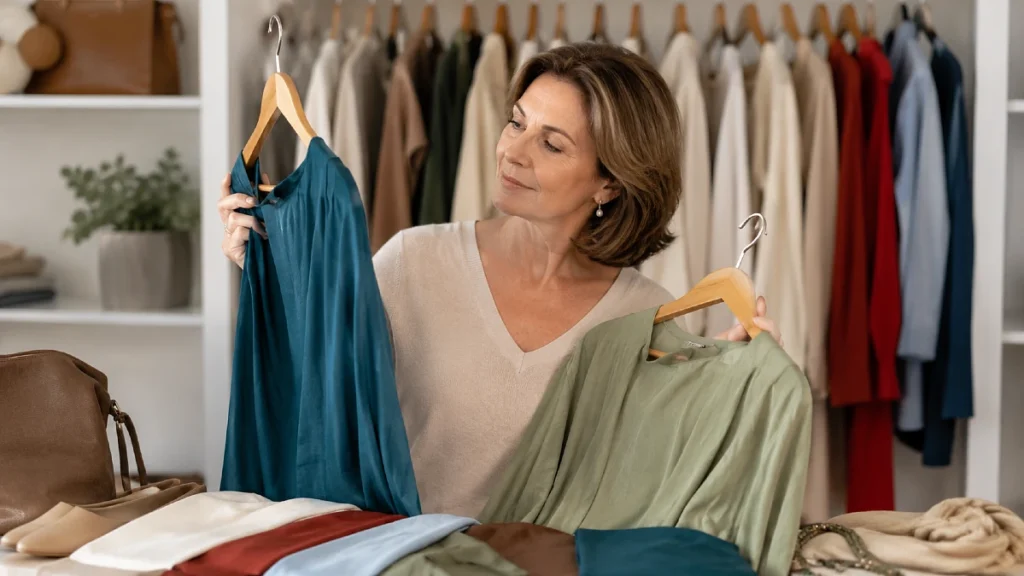
Pantone named Cloud Dancer, a soft white, as its 2026 Color of the Year, while its Spring/Summer 2026 fashion color report includes shades such as Alexandrite teal, Lava Falls red, White Onyx, and Sage Green.
Vogue UK also highlighted summer 2026 colors like turquoise, sky blue, butter yellow, olive green, and tomato red.
That mix tells us something useful.
The year is not just about loud color. It is about balance.
A good 2026 color should do one of three things:
- Freshen your neutrals
- Bring warmth back to your face
- Add one modern note to simple clothes
Color note: the most wearable trend color is often not the brightest version. Tomato red can become a red handbag. Butter yellow can become a soft knit. Turquoise can become earrings, a scarf, or a linen shirt.
Start With the New Neutrals: Soft White, Cocoa, Sage, and Olive
The easiest way to try 2026 color is not through bold shades first.
Start with the new neutrals.
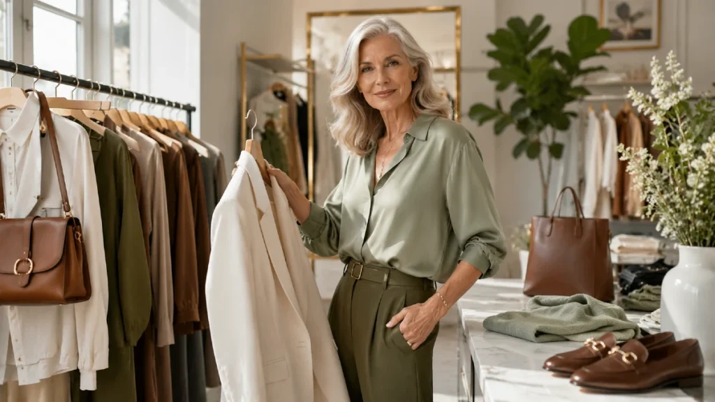
Soft white, cocoa brown, sage green, and olive feel current without shouting. They also work beautifully for mature style because they soften the outfit without making it look weak.
A soft white shirt looks less harsh than bright optic white. Cocoa brown feels warmer than black. Sage and olive bring color into the wardrobe, but they still act calm enough for errands, lunch, travel, and smart casual days.
These shades are especially helpful when you want everyday outfits for women over 50 to look polished but not overdone.
| Color Trend | What to Look For | Mixes With |
|---|---|---|
| Soft white | Cotton shirt, knit tee, linen blazer | Denim, navy, camel, cocoa |
| Cocoa brown | Wide-leg trousers, belt, bag, loafers | Cream, sage, pale blue, blush |
| Sage green | Utility jacket, cardigan, soft blouse | White, denim, tan, chocolate |
| Olive | Relaxed pants, shirt dress, light jacket | Black, ivory, stripes, gold jewelry |
| Warm beige | Trench, knit vest, straight skirt | Red, teal, white, denim |
These colors work because they lower contrast.
That can make an outfit feel softer around the face, especially when black feels too heavy. You do not have to remove black from your closet. Just give it warmer company.
Try this: wear black trousers with a soft white blouse and cocoa loafers instead of a black top and black shoes. The outfit still feels neat, but it looks lighter and more modern.
Use Bright Colors as Accents, Not a Personality Change
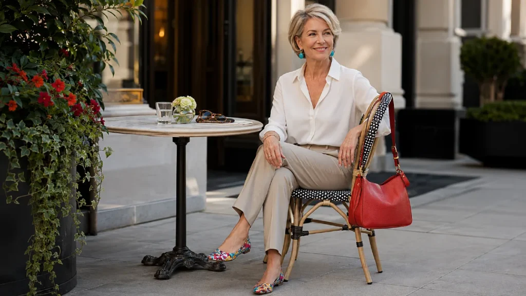
Bright color is where many women get nervous.
That is fair.
A full tomato red dress or lime jacket may feel exciting on a runway and completely wrong at the grocery store. But color does not have to take over the whole outfit.
The smarter move is to treat bright shades as accents.
Tomato red, turquoise, fuchsia, citrus yellow, and vivid blue can make simple outfits feel current when they appear in smaller places: shoes, earrings, bags, scarves, belts, or one blouse under a jacket.
This is where trendy outfits for women over 50 become wearable. The trend is present, but you are still in charge.
| Instead of This | Try This |
| A full bright red outfit that feels too bold | A red flat, red bag, or red cardigan over neutrals |
| Neon yellow near the face | Butter yellow knit, scarf, or bag |
| Head-to-toe turquoise | Turquoise earrings, sandals, or a linen shirt |
| Fuchsia satin dress for day | Fuchsia blouse under a navy blazer |
| Lime green pants | Lime scarf with white shirt and denim |
The reason this works is proportion.
When a strong color is small, it reads as style. When it is everywhere, it can feel like a costume if you are not used to it.
Shoe swap: a red ballet flat or low block heel can make jeans and a white shirt feel finished without changing the whole outfit.
Choose Fabrics That Make Trend Colors Look Expensive
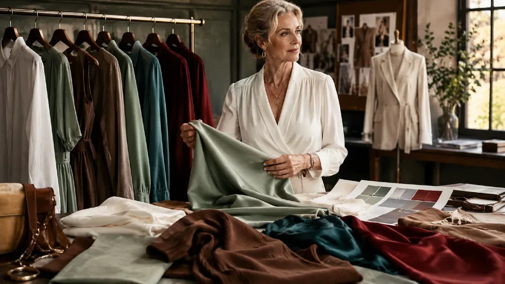
Color is only half the story.
Fabric decides if that color looks chic or cheap.
A bright shade in thin, clingy fabric can feel unforgiving. The same color in linen, cotton poplin, suede, leather, satin, or a fine knit can look grown-up and intentional.
This is why two women can wear the same color and get a very different result.
One looks polished. The other feels like the color is wearing her.
For 2026, pay close attention to texture. Soft white looks beautiful in cotton, linen, denim, and knitwear. Tomato red works well in leather accessories, crisp shirting, or a smooth cardigan. Sage looks best when the fabric has a little structure, like twill, poplin, or a soft jacket.
| Fabric | Best 2026 Colors | Why It Works |
| Linen | Soft white, olive, sky blue | Breathable, relaxed, elegant casual |
| Cotton poplin | White, red, pale blue | Crisp shape keeps color clean |
| Fine knit | Butter yellow, sage, blush | Soft color feels cozy, not childish |
| Suede or faux suede | Cocoa, olive, burnt orange | Adds depth and warmth |
| Satin or silky fabric | Teal, red, purple | Lets rich color look dressy |
Fabric note: shine makes color louder. Matte texture makes color calmer.
So if teal feels too much in satin, try it in a cotton shirt. If red feels too sharp in a blazer, try it in a leather bag.
This is how you adjust the trend to your comfort level instead of rejecting it completely.
Build a Simple Color Formula You Can Repeat
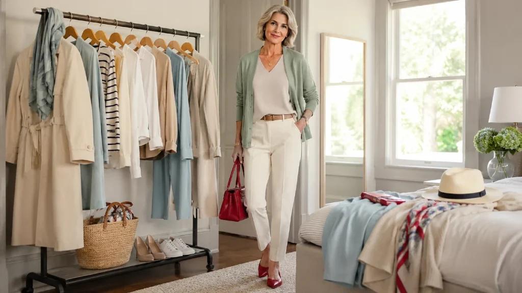
A good wardrobe does not need endless choices.
It needs a few formulas you trust.
For color, the easiest formula is this:
Formula: one calm base + one soft color + one small accent.
That could mean ivory jeans, a sage blouse, and a red flat. Or dark denim, a soft white tee, and a turquoise necklace.
The base keeps you grounded. The soft color makes the outfit fresh. The accent adds personality.
Here are a few easy outfit formulas that work for real life.
| Occasion | Pieces | Why It Works |
| Errands | Straight jeans + soft white tee + red flats | Simple base with one cheerful accent |
| Lunch with friends | Cocoa trousers + pale blue shirt + gold jewelry | Warm, polished, and easy to wear |
| Travel day | Olive pants + cream knit + brown sneakers | Comfortable but still pulled together |
| Casual dinner | Dark denim + teal blouse + neutral sandals | Rich color near the face feels special |
| Work-from-home | Sage cardigan + white tank + soft black pants | Relaxed, neat, and not fussy |
The beauty of this formula is that it does not depend on shopping.
You may already own the base pieces. The only update might be a scarf, shoe, top, or cardigan in a fresher color.
Budget-friendly swap: before buying a new dress in a trend shade, try the color in a scarf or inexpensive tee. Wear it twice. Notice how it feels in daylight, at dinner, and with your usual makeup.
Match Color to Where You Wear It
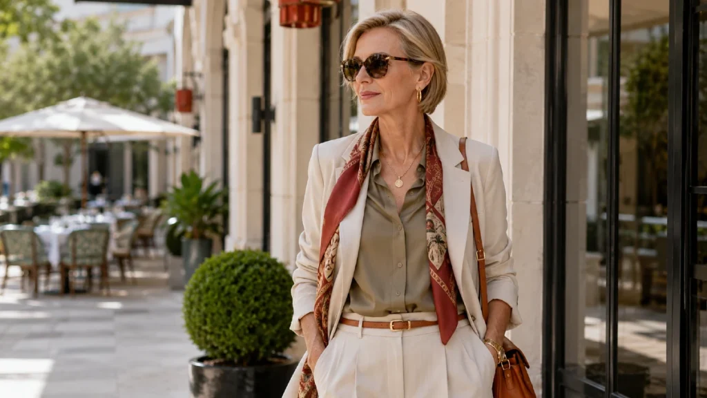
A color that feels right on vacation may feel wrong at a meeting.
That does not make the color bad. It means the setting needs a different dose.
For relaxed days, sky blue, soft white, olive, and butter yellow feel easy. For dressier moments, teal, deep red, cocoa, and purple carry more presence. For travel, the best shades are the ones that hide small wrinkles and mix with two pairs of shoes.
This is where capsule wardrobe over 50 thinking becomes useful.
You are not buying random colors. You are choosing shades that work across your week.
A soft white blazer can go over jeans, a dress, or black pants. Cocoa loafers can replace black shoes when you want warmth. A teal blouse can dress up trousers without needing much jewelry.
Seasonal swap: in warm months, wear soft white with sky blue and tan. In cooler months, wear the same soft white with cocoa, olive, and deep red.
That small shift keeps your wardrobe current without starting over.
The Colors to Be Careful With and How to Make Them Work
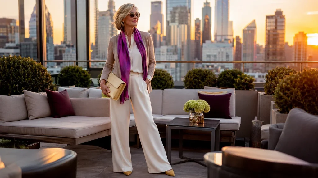
Some 2026 colors need a little handling.
That does not mean they are off-limits.
It only means they need the right fabric, placement, or pairing.
Lime, vivid yellow, and high-shine purple can look strong fast. If they excite you, use them. If they make you hesitate, soften them.
Try lime as a print detail instead of a solid top. Choose butter yellow instead of neon yellow. Wear purple in suede shoes or a satin clutch rather than a full glossy outfit.
The goal is not to hide from color.
The goal is to make color serve you.
What to avoid: buying a trend color just because it is everywhere. A shade should make your face look awake, your outfit easier to build, or your existing wardrobe feel fresh.
If it does none of those things, admire it and move on.
2026 Color Strategy
How women over 50 can effortlessly integrate this year’s top hues into a polished wardrobe.
The 2026 Palette
Tap to flip ⟳Soft white, sage green, olive, cocoa brown, sky blue, tomato red, teal, butter yellow, and turquoise. Start with one calm shade and one accent.
Wearing Brights
Tap to flip ⟳Brights look beautiful at any age. Try red shoes, a teal blouse, or a yellow scarf before committing to the shade head to toe.
Polished Hues
Tap to flip ⟳Cocoa brown, olive, deep teal, navy, and soft white pair easily with basics and feel much less harsh than stark black when worn near the face.
Subtle Integration
Tap to flip ⟳Keep outfits simple and let one color do the work. A white shirt, straight jeans, and red flats look more modern than five trends at once.
Wardrobe Strategy
Tap to flip ⟳Update around what already works. Add one fresh neutral, one soft color, and one accent shade that mixes effortlessly with your existing basics.
Frequently Asked Questions
What colors are trending for women over 50 in 2026?
Soft white, sage green, olive, cocoa brown, sky blue, tomato red, teal, butter yellow, and turquoise are among the most wearable 2026 color directions. The best choice depends on your wardrobe, contrast level, and comfort with color. Start with one calm shade and one accent instead of changing everything.
Can women over 50 wear bright colors?
Yes, bright colors can look beautiful at any age. The key is placement and proportion. Try red shoes, a teal blouse, a turquoise necklace, or a yellow scarf before wearing the shade head to toe.
What color makes an outfit look more polished?
Soft white, cocoa brown, navy, olive, and deep teal often look polished because they pair easily with wardrobe basics. They also feel less harsh than stark black when worn near the face. Fabric matters too, so choose clean cotton, smooth knits, linen, suede, or structured blends.
How do I add trendy colors without looking try-hard?
Keep the outfit simple and let one color do the work. A white shirt, straight jeans, and red flats can look more modern than a complicated outfit with five trends at once. Chic outfits for women over 50 often come from restraint, fit, and one well-chosen detail.
Should I change my whole wardrobe for 2026 color trends?
No. A better move is to update around what already works. Add one fresh neutral, one soft color, and one accent shade that mixes with your basics. That gives you more outfits without waste.
Conclusion
Color after 50 is not about chasing every trend.
It is about finding the shades that make your clothes feel alive again. A soft white shirt, cocoa shoe, sage layer, or red accessory can change the whole mood of an outfit without changing who you are.